
API Quality Metrics That Matter to Engineering Leaders (2026)
Quick answer
Pass rate alone is misleading — a 97% pass rate on a suite covering 40% of endpoints is worse than an 88% pass rate on a suite covering 95%. The metrics that actually predict production risk are coverage depth, regression trend, change failure rate, and time-to-detect. Coverage depth and regression trend are leading indicators; pass rate and incident count are lagging. Different stakeholders — engineering leaders, QA leads, DevOps — need different views of the same underlying data.
Reviewed by Parveen Kumari
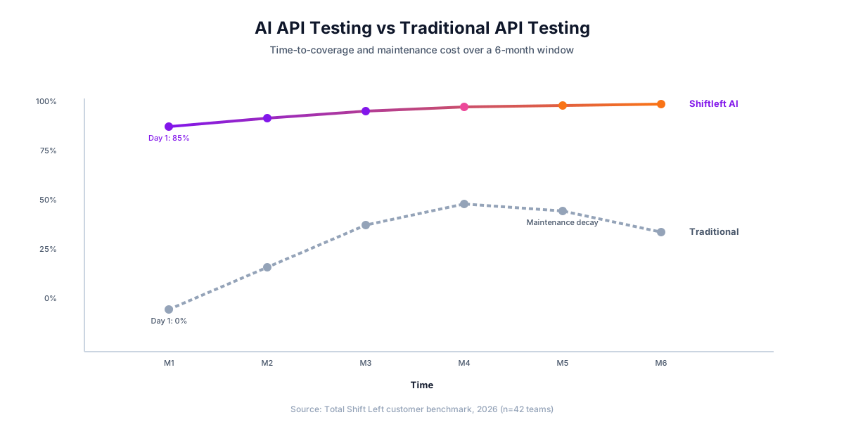
Ask ten engineering leaders how their API quality is trending and most will answer with a pass rate: "we're at 97% green." It sounds reassuring and means almost nothing. A 97% pass rate on a suite that tests 40% of your endpoints is worse than an 88% pass rate on a suite that tests 95% of them — but the first number looks better on a slide. The metrics that actually predict production risk are quieter, and they rarely fit in a single number.
This guide covers the API quality metrics that matter to the people accountable for outcomes — coverage depth, regression trend, change failure rate, and time-to-detect — and why the right view of those metrics depends on who is reading. It builds on the broader treatment in our guide to DevOps metrics and software quality.
In this guide
- Why pass rate misleads
- The metrics that predict risk
- Leading vs lagging indicators
- Different stakeholders need different views
- Turning metrics into decisions
- Query the metrics instead of collecting them by hand
- The metrics worth reporting, and what each one hides
- Where the numbers actually come from
- Setting the first target
- What to do when a number moves the wrong way
- Frequently asked questions about API quality metrics
- A quarterly reporting pack that people read
- The anti-patterns worth naming
Why pass rate misleads
Pass rate is a ratio with a hidden denominator. It tells you what fraction of the tests you wrote are passing — not what fraction of your API is tested. A suite can be 100% green and leave entire endpoints, error paths, and edge cases completely unexercised. Worse, a high pass rate on a flaky suite masks instability: if 3% of your tests flip between pass and fail run to run, "97% green" is noise, not signal.
The fix is to always read pass rate next to two things: how much of the spec the suite actually covers, and how stable the results are over time.
The layer definitions this rests on are set out in unit vs integration vs system testing.
Scoring quality across a dataset rather than asserting on one response is its own discipline — see the LLM evals guide.
The metrics that predict risk
Four metrics do most of the predictive work:
- Coverage depth. Not just "which endpoints are hit" but which parameters, status codes, and schema constraints are validated. Our guide on how to measure API test coverage breaks this into functional vs production-grade coverage — the difference between "we call the endpoint" and "we validate the contract, auth depth, and error bodies."
- Regression trend. Are previously passing tests starting to fail, and is the rate accelerating? A single failure is noise; a trend is a leading indicator of decay. Automated regression and flaky-test analysis separates real regressions from flakiness so the trend line means something.
- Change failure rate. What fraction of releases introduce a test failure or incident? This is the DORA metric that most directly reflects API stability.
- Time-to-detect. How long between a breaking change landing and a test catching it? Shorter is cheaper — the entire economic argument for shifting left, which we quantify in shift-left ROI.
Leading vs lagging indicators
Pass rate and incident count are lagging — they tell you about damage already done. Coverage depth and regression trend are leading — they tell you where damage is about to happen. Engineering leaders who only watch lagging indicators are always reacting. The ones who watch coverage gaps and regression trends are steering. A practical rule: for every lagging metric on your dashboard, add the leading metric that predicts it.
Which tests you even run against a given change is its own leverage point — risk-based test selection focuses effort on the highest-risk areas instead of running everything and hoping.
Different stakeholders need different views
The same underlying data means different things to different people, and forcing everyone through one generic dashboard buries the signal each role needs:
- An engineering leader wants quality-and-risk at a glance — change failure rate, coverage trend, where risk is concentrated.
- A QA lead wants coverage depth and test stability — what is untested, what is flaky.
- A DevOps lead wants pipeline health — where quality gates are blocking, how long suites take.
Rather than one report for all, role-tailored persona dashboards give each stakeholder the view tuned to their decisions, with the same live data underneath. The real-time analytics dashboard provides the shared source of truth those views draw from. For defining the thresholds that gate a release, see API quality gates: what to measure.
Ready to shift left with your API testing?
Try our no-code API test automation platform free. Generate tests from OpenAPI, run in CI/CD, and scale quality.
Turning metrics into decisions
Metrics are only useful if they change behavior. Wire each one to a decision: coverage below threshold blocks a release; a regression trend triggers a review; a rising change failure rate reprioritizes hardening work over features. A dashboard nobody acts on is theater. The goal is not a prettier chart — it is a shorter distance between "something is degrading" and "someone did something about it."
Query the metrics instead of collecting them by hand
The metrics that predict risk are already in your telemetry. These four PromQL expressions give the leading indicators — error rate, tail latency, and the share of traffic hitting endpoints with no test coverage:
# 1. error rate per endpoint (the lagging indicator everyone already has)
sum by (route) (rate(http_requests_total{status=~"5.."}[5m]))
  / sum by (route) (rate(http_requests_total[5m]))

# 2. p99 latency per endpoint against the SLO
histogram_quantile(0.99,
  sum by (route, le) (rate(http_request_duration_seconds_bucket[5m])))

# 3. traffic share on endpoints your suite never exercises
sum(rate(http_requests_total{tested="false"}[1h]))
  / sum(rate(http_requests_total[1h]))

# 4. error budget burn over the 30-day window
1 - (
  sum(rate(http_requests_total{status!~"5.."}[30d]))
  / sum(rate(http_requests_total[30d]))
) / (1 - 0.999)
The metrics worth reporting, and what each one hides
Every metric on this list is useful and every one of them is gameable. Report them in pairs so the gaming is visible:
| Metric | What it tells you | Leading or lagging | How it gets gamed | Pair it with |
|---|---|---|---|---|
| Test pass rate | Almost nothing on its own | Lagging | Delete or skip the failing test | Quarantine count and age |
| Endpoint coverage | How much of the API surface is exercised at all | Leading | One happy-path call per endpoint | Response-code and schema coverage |
| Line coverage | Whether code paths run under test | Leading | Tests with no assertions | Mutation score |
| Change failure rate | How often a release causes an incident | Lagging | Fewer, larger releases | Deployment frequency |
| Escaped defect rate | What the suite is missing | Lagging | Reclassifying bugs as expected behaviour | Time to detect |
| p99 latency vs SLO | Whether performance is regressing | Leading | Report the median instead | Error budget burn |
| Mean time to restore | How fast you recover | Lagging | Close incidents early | Incident reopen rate |
The two that predict the most and get reported the least are mutation score and quarantine age — the first shows whether the tests would actually catch a defect, the second shows how much of the suite has been quietly switched off.
Where the numbers actually come from
The objection to any metrics programme is that collecting the data is a project. For most of these it is not — the sources already exist, and the work is querying them rather than building a pipeline.
| Metric | Source that already has it |
|---|---|
| Escaped defects | The issue tracker, filtered to bugs reported after release |
| Mean time to detection | The gap between the merge that introduced it and the first report |
| Coverage against the contract | The OpenAPI document versus the suite's operation list |
| Suite runtime and flake rate | CI run history, which every provider retains |
| Change failure rate | Deployment records plus rollback or hotfix events |
The two that need deliberate instrumentation are escaped defects and mean time to detection, and both need one discipline rather than one tool: when a bug is filed, record when it was introduced and how it was found. That single field turns an issue tracker into the source for the two metrics that predict risk better than anything else on the list.
Start with what a single query can answer. A metrics programme that requires a data warehouse before it produces its first number tends not to produce one.
Setting the first target
The most common failure is setting a target before knowing the baseline, which produces either a number everyone already meets or one nobody can reach. Both stop being mentioned within a quarter.
Measure for one full delivery cycle before committing to anything. Then set the first target at the point you are already close to reaching — the aim of a first target is to establish that the metric moves and that moving it is worth doing, not to close the whole gap at once. Tighten it after the team has hit it twice.
Two rules keep targets honest.
Only target what the team controls. Escaped defects are influenced by how much gets shipped and by what other teams do; suite coverage and flake rate are not. Targets on the second kind change behaviour. Targets on the first kind produce arguments about attribution.
Never target a metric that can be satisfied trivially. Line coverage is the standard example — it rises with generated tests that assert nothing. If a target can be met without the underlying thing improving, it will be, and not out of bad faith: people optimise what is measured, because that is what being measured means.
Free YAML templates + guide
CI/CD Testing Pipeline Templates
Production-ready CI/CD pipeline templates for GitHub Actions and GitLab CI. Includes API testing, contract testing, and performance testing stages.
Download FreeWhat to do when a number moves the wrong way
A metric going the wrong way is information, and the reflex it triggers determines whether anyone keeps reporting honestly.
Ask what changed before asking who. Flake rate rising after a new parallel runner landed is a configuration problem, not a discipline problem. Most adverse movements have a proximate technical cause, and looking for it first is both faster and less corrosive than looking for a responsible party.
Check the denominator. Escaped defects doubling while release frequency tripled is an improvement per release. Raw counts mislead whenever throughput is also changing, which it usually is.
Distinguish a step change from a trend. One bad month is noise more often than it is a signal. Two consecutive months moving the same way is a trend worth a decision. Reacting to every fluctuation trains people to stop surfacing them.
The organisational point matters more than any of the individual metrics: a reporting pack that only ever contains good news has stopped measuring anything. The value of the numbers is entirely in whether they can say something uncomfortable and be believed.
Frequently asked questions about API quality metrics
What is the single most important API quality metric? There isn't one — but if forced to pick a pair, coverage depth and regression trend together predict more risk than any single number, because one tells you what's tested and the other tells you what's decaying.
Is a 100% pass rate a good sign? Only alongside high coverage and low flakiness. On a shallow or flaky suite, 100% green is a false comfort.
How do these map to DORA metrics? Change failure rate is a direct DORA metric; time-to-detect and regression trend feed into lead time and mean-time-to-restore. API quality metrics are the testing-layer inputs to the DORA outcomes.
Why do stakeholders need different dashboards? Because they make different decisions. A leader steering roadmap risk and a QA lead hunting flaky tests need different cuts of the same data; one generic view serves neither well.
Want role-tailored quality dashboards on live data? Explore the platform or start a free trial.
A quarterly reporting pack that people read
Most API quality reporting fails for the same reason: it shows everything, so nobody can tell what changed. A pack that gets read has four slides and one table.
Slide 1 — outcomes. Escaped defects and change failure rate, per quarter, per service. These are the only two numbers a non-engineering audience should have to interpret.
Slide 2 — the leading indicators that moved. Endpoint coverage, mutation score, quarantine age. One chart, four quarters, no more than six services.
Slide 3 — reliability against commitments. p99 latency and availability against the SLO, with error-budget burn. This is the slide that connects quality work to customer experience.
Slide 4 — what we are going to do about it. Two or three decisions, each attached to a number on the previous slides.
-- the query behind slide 1, per service per quarter
SELECT date_trunc('quarter', d.deployed_at) AS quarter,
       d.service,
       count(*)                                                   AS deploys,
       count(i.deployment_id)::float / nullif(count(*), 0)        AS change_failure_rate,
       count(DISTINCT e.id)                                       AS escaped_defects
FROM deployments d
LEFT JOIN incidents i ON i.deployment_id = d.id
LEFT JOIN defects  e ON e.service = d.service
                    AND e.found_in_environment = 'production'
                    AND e.created_at BETWEEN d.deployed_at AND d.deployed_at + interval '30 days'
WHERE d.deployed_at > now() - interval '1 year'
GROUP BY 1, 2
ORDER BY 1 DESC, change_failure_rate DESC;
Everything else belongs in a dashboard people can open when they want detail. A pack that includes it is a pack that gets skimmed.
The anti-patterns worth naming
Four reporting habits actively make quality worse, and all four are common enough to be worth calling out by name.
Ranking teams on a single number. Whatever the number is, it becomes the target and stops measuring. Coverage percentages rise, assertions disappear. Report per-service trends, not a leaderboard.
Reporting absolute defect counts without exposure. A service with ten defects and a hundred million requests is in better shape than one with two defects and a thousand. Normalise by traffic or by release, or the number rewards low usage.
Averaging latency. The mean hides exactly the users who are having a bad time. Report p99 against the SLO, and error-budget burn alongside it.
Measuring only what the pipeline emits. Everything in CI is a proxy. The outcome metrics — escaped defects, change failure rate, time to restore — come from incident and deployment data, and a programme that never leaves the pipeline is measuring its own activity.
The test for any metric on your list: name a decision that would change if the number moved by 20%. If nobody can, it is overhead, and removing it makes the remaining numbers easier to see.
Sources and further reading
- DORA State of DevOps research — the multi-year dataset behind the four delivery metrics.
- Accelerate / DORA four key metrics — the definitions behind lead time, deploy frequency, CFR and MTTR.
- Google SRE Workbook — Implementing SLOs — how to define SLOs and error budgets.
Key takeaways
- Pass rate is the metric most often reported and the one that predicts least — it goes up when a failing test is deleted.
- Report metrics in pairs (coverage with mutation score, change failure rate with deployment frequency) so the gaming is visible in the same table.
- The two leading indicators worth adding first are endpoint coverage against the spec and quarantine age, because both are cheap to compute and hard to fake.
- Different audiences need different views: engineers need per-service trends, leadership needs escaped defects and change failure rate, auditors need retained evidence.
- A metric nobody acts on should be dropped. If no decision has ever changed because of a number, it is reporting overhead, not measurement.
Ready to shift left with your API testing?
Try our no-code API test automation platform free.